Breast Enlargement

Amazing new techinique of sub-fascial breast augmentation gives our patients the most natural breasts ever.

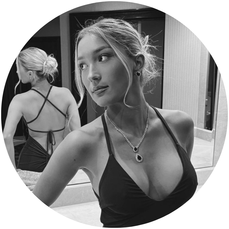
Look striking in your bikini and clothes.

Recover from breast feeding. Get rid of those saggy breasts with a breast augmentation combined with an uplift, with a lollipop shaped scar.
Breast Enlargement

A carefully performed sub-facial augmentation Gives our patients the most beautiful breasts possible.

Recapture those youthful curves.

Make your breasts larger. Increase the fullness of the upper part of your breasts and cleavage.

Many women consider breast enlargement surgery, otherwise known as breast enhancement or a 'Boob job.' There are a number of different reasons for this; often women have breasts that never fully develop or have developed unevenly, some women have always felt their breasts were too small, while other women experience changes in their breasts’ size and shape during pregnancy, weight loss and age.
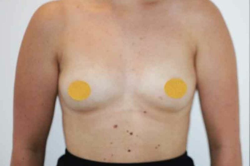
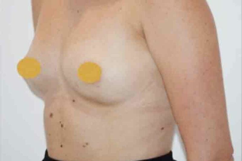
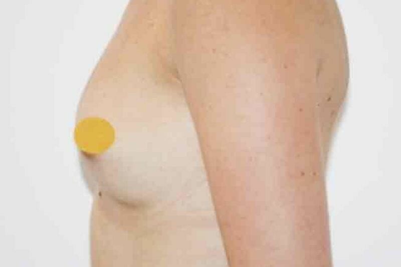
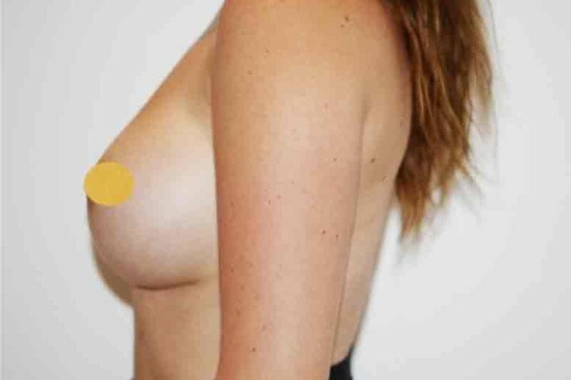
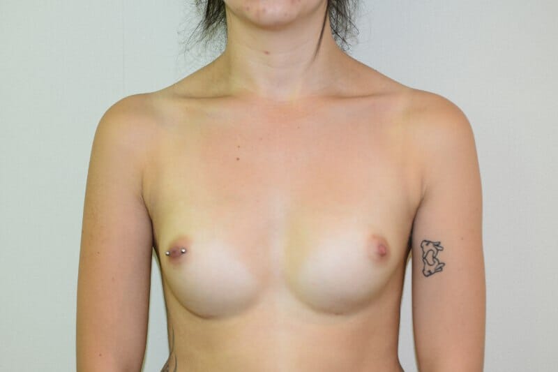
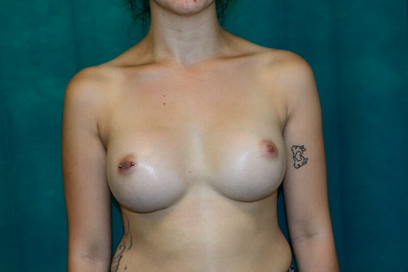
Typical breast enlargement patients
Whatever your reasons for considering breast enlargement, it is important to remember that the decision is yours alone. You should never consider having the surgery to please someone else. You should also remember that, like all aesthetic surgery, breast enlargement can only change your figure, not your life.
You could be a candidate for breast surgery if you experience any of the following:
- You are unhappy with the size or shape of your breasts.
- Clothes don’t fit well around your breasts.
Your breasts are different sizes. - Your breasts have changed in size or firmness due to breastfeeding or weight loss.
Choices of breast
implants
Breast implants are available in many different shapes and sizes. There are also different locations within the breast where implants can be placed.
Patients can also choose how firm they would like their breast implants. This can be adjusted by changing the level of fill inside the implant.
During your initial consultation Paul will discuss with you what you hope to achieve. He will talk you through all the options available so you can feel completely comfortable in making a decision.
VECTRA 3D Imaging
As part of your consultation, you will also have photographs taken in 3D, which will be morphed in front of you to give you an idea of what you could possibly look like with different shapes, sizes and types of implants. Please insert a VECTRA image and link to the VECTRA page
Book consultation
About the Treatment
")
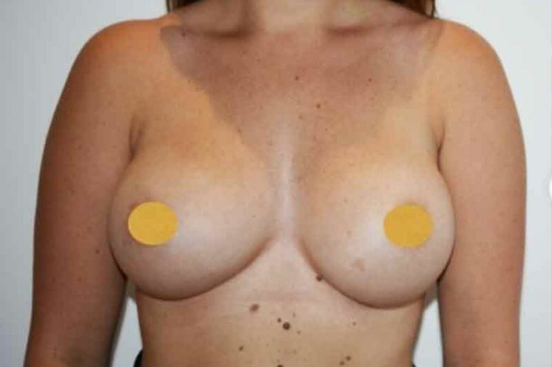
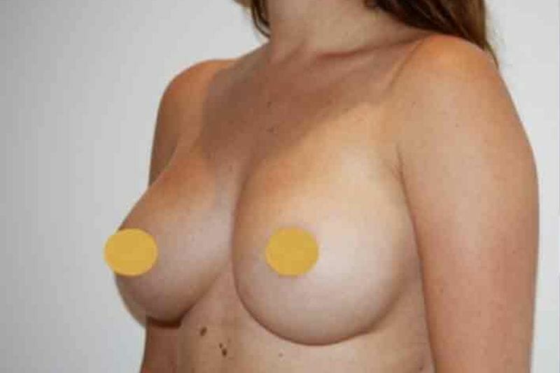
THE RESULTS